Landing Page Design: 9 Ways to Turn More Visits Into Enquiries
A high-converting landing page creates one clear path from the visitor’s question to a confident next step.
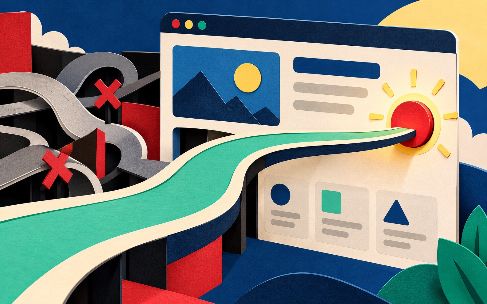
A landing page does not need more sections, more animation, or more persuasive adjectives. It needs to make the next decision easier. The strongest pages connect one audience, one need, and one useful action.
1. Match the message to the visit
The headline should continue the conversation that brought someone to the page. If an advert promises a website audit, the page should lead with that audit, not a general description of the company.
2. Make the value clear above the fold
Visitors should quickly understand what you offer, who it helps, and why it is worth their attention. Specific language beats broad claims such as “innovative solutions” because it gives people something concrete to evaluate.
3. Choose one primary action
Multiple competing buttons create hesitation. Decide what the page is for, booking a call, requesting a quote, starting a trial, or downloading a guide, and make that action visually clear. Secondary links can exist, but they should not fight for equal attention.
4. Put proof near the claim
Testimonials, results, recognisable clients, demonstrations, and case studies work best when they support a specific promise. Place proof close to the statement it validates rather than collecting every logo in an unrelated strip.
5. Answer objections in the page flow
Think about what could stop a visitor: price uncertainty, implementation time, trust, internal approval, or fear of choosing the wrong solution. Address those concerns before the call to action with honest explanations, examples, or FAQs.
6. Reduce form friction
Ask only for information needed for the next step. Use clear labels, useful error messages, comfortable spacing, and the correct mobile input type. A shorter form is not always better, but every field should earn its place.
7. Use visual hierarchy to guide attention
Size, contrast, spacing, and rhythm should reveal the page’s logic. A visitor scanning headings and highlighted elements should still understand the main story. Decoration should support that path rather than interrupt it.
8. Protect speed and accessibility
A delayed hero image or an inaccessible form can lose an enquiry before the message has a chance to work. Optimise media, test keyboard navigation, keep text readable, and verify the experience on real mobile screens.
9. Test the weakest assumption
Do not change five things at once. Use analytics, recordings, interviews, or sales feedback to find the biggest point of uncertainty. Then test one meaningful change, such as the offer, headline, proof, or form, against a clear outcome.
Conversion improves when clarity, confidence, and momentum improve together.
A landing page is part of a larger experience. The promise in the advert, the page itself, the confirmation message, and the follow-up should feel connected. That continuity is what turns a click into trust.
Frequently asked questions
What is a good landing page conversion rate?
There is no universal number. Traffic source, offer, price, audience, and the size of the commitment all affect the rate. Compare against your own baseline and qualified outcomes.
How long should a landing page be?
Long enough to make the decision clear. A simple offer may need a short page, while an expensive or unfamiliar service may require more proof and explanation.
Should a landing page include navigation?
It depends on the goal. Focused campaign pages often reduce navigation, while service pages may benefit from giving visitors access to supporting work and company information.